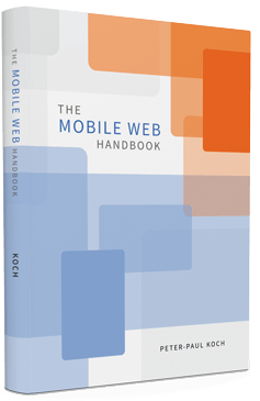

And it’s a wrap. Last Thursday, while being in Zürich, I did the absolutely last edits for The Mobile Web Handbook, my new book published by Smashing Magazine. You can order it and get the e-book right now; the printed book will go out in late September.

I’m glad I took the time for those last edits; there was one page-break problem that messed up about five pages, but we caught that in time. Other than that I’m in the “Oh my, will people EVER understand what I’m talking about?” phase, but I know from my previous book that I’m worrying over nothing.
Fair warning: the Mobile Web Handbook does not contain your favourite mobile tip or trick. Instead, it contains mine. I already gave the table of contents in an earlier post, but it’s good to stress here that the book only talks about techniques that are unique to mobile devices (and tablets): viewports, touch events, and a much more complicated browser ecosystem. To quote from the Introduction:
This book only investigates fundamental differences between desktop and mobile, and generally ignores topics such as AppCache, which, though more important on mobile than on desktop, are not unique to mobile. This is sometimes a subtle distinction, but it helped me a lot in keeping the scope of this book, and of my research, to manageable levels.
Anyway, the best way to judge the book is to see for yourself — and it isn’t that expensive.
This is the blog of Peter-Paul Koch, web developer, consultant, and trainer.
You can also follow
him on Twitter or Mastodon.
Atom
RSS
If you like this blog, why not donate a little bit of money to help me pay my bills?
Categories: