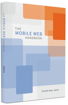

On Tuesday I delivered the final edits for The Mobile Web Handbook, my new book published by Smashing Magazine. Order it here.

The book is a bit late; it was originally slated to appear in June. However, it’s really done now; you can expect the e-book in about a week and the physical book at the end of September. Right now the only unresolved issues are a few minor styling ones, as well as the index. I expect both to be solved somewhere next week.
Writing a book about the mobile market and the mobile web is tricky. Circumstances change faster than I can keep up with even on a blog, let alone in a book that’s already slightly outdated by the time it reaches the consumer. That’s why I decided to talk about mobile web fundamentals such as the viewports and touch events, as well as the browser market, especially the Android one. These topics will remain important in years to come, even though browser compatibility patterns will continue to shift. The gory compatibility details are on the companion pages (work in progress; not ready yet.)
The Mobile Web Handbook. Written by me. Tech editor: Stephanie Rieger. Design and illustrations: Stephen Hay. General editor: Vitaly Friedman. Copy editor: Owen Gregory. Additional editors: Patrick Lauke, Max Firtman, and Vasilis van Gemert. Production: Markus Seyfferth.
Here’s the table of contents:
screen.width/height problem, and related topics.In general, and with my financial well-being in mind, I’d say everyone who reads this should buy it. That especially goes for web developers who want to understand mobile browsers and the mobile web more than they do today.
This is the blog of Peter-Paul Koch, web developer, consultant, and trainer.
You can also follow
him on Twitter or Mastodon.
Atom
RSS
If you like this blog, why not donate a little bit of money to help me pay my bills?
Categories: