JavaScript archives
Compatibility
Thidrekssaga
QuirksBlog
Donations
CSS book
Politics
Mobile
About
COH
Back in April I lamented numerous problems and vaguenesses in the current W3C Device Adaptation spec. One of the spec’s editors, Florian Rivoal, contacted me, agreed that the spec had some problems, and explained some of its less clear features to me. In return, I explained some features I think should be added to the spec.
Within about ten mails we had agreed on the features that a future version of the spec should contain. This article summarises our conclusions, and adds a few questions a future version of the spec should answer.
Also, this article serves as a quick overview of where the viewports stand today. Everything described below works in almost all browsers right now, with the exception of the @viewport syntax. So this is useful reading for every web developer.
Finally, there’s one question that must be answered: If you use (x-based) responsive images on a desktop site, and the user zooms in, should you load the higher-DPR images? The answer is important for defining desktop DPR and screen.width/ height.
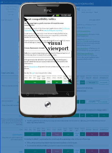
As I explained earlier mobile browsers have a layout viewport, which sets the initial containing block and thus dictates how much space the CSS layout has, and a visual viewport that shows how much of that layout viewport the user is currently seeing. (Desktop browsers have them as well, but they’re the same thing: the browser window.)
This article treats the following topics:
Update: Meanwhile I started working on a viewports visualisation app. You might want to use it first in order to understand some viewport basics.
The visual viewport is the number of CSS pixels the user is currently viewing. The user can change the visual viewport size by zooming in or out. window.innerWidth/ Height exposes the current visual viewport size in JavaScript. That’s easy — but it isn’t in the spec. It should be.
The layout viewport defines the size of CSS’s initial containing block. If the body has width: 100%, how wide is it? As wide as the layout viewport.
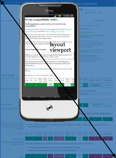
That’s easy as well, but there are several wrinkles here. Most importantly, both browsers and authors can set the size of the layout viewport. With that in mind, Florian and I split the layout viewport into four:
Responsive design is based on setting the actual layout viewport to the ideal layout viewport dimensions.
The initial layout viewport is not important to web developers, who can skip this section if they want to.
W3C is making a big push toward initial values: before even the browser style sheet is applied, let alone the author style sheet, all CSS declarations on all elements have their initial value as defined in the spec. (Web developers can set any CSS declaration to the special value initial, which is equal to whatever the spec defines as its initial value.)
For instance, every element has a display: inline because that’s the initial value the spec defines. Later on, the browser style sheet sets block-level elements to display: block. Style sheets written by web developers may change this again.
In theory, the layout viewport size is set by the CSS @viewport {width: something} directive. (In practice it isn’t because @viewport is hardly supported, but the spec is supposed to incorporate theory as well as practice.) This declaration has an initial value of auto, and that causes the initial layout viewport to be equal to the ideal one.
Personally I’m not a huge fan of the initial values, since I fail to see their point, and they’re sometimes rather arbitrary. Why display: inline? Why would web developers want to set any declaration to its initial value?
Still, though the initial layout viewport may be confusing and/or pointless, it doesn’t actually do any harm. So let’s leave it in if it makes W3C and the browser makers happy. Just remember it’s not important to web developers.
The browser style sheet contains a default width for the layout viewport. In mobile browsers, its width is between 800 and 1024 CSS pixels, with modern ones tending toward the higher end of that range.
The purpose of the default layout viewport is to accomodate websites that are not optimised for mobile at all. Mobile browsers must display these sites decently, and that means preserving the layout the author intended, even though it’s way too large for the device screen. In order to do that, mobile browsers stretch up their layout viewports to desktop-like values. I explained this problem in detail years ago.
So if a website is not mobile-optimised because the author did not include a meta viewport tag, it will use the default layout viewport.
Still, mobile browsers prefer to show sites sized to the ideal dimensions for the devices they run on. These dimensions are the ideal layout viewport, and web developers can set the layout viewport to these ideal sizes by doing:
<meta name="viewport" content="width=device-width">
In theory they can also do the following, but it’s only supported in MS Edge and IE, and prefixed at that:
@viewport {
	width: auto;
}
In JavaScript, screen.width/ height MAY expose the ideal viewport dimensions. Or it may not. Or the browser kludgily redefines the ideal layout viewport before exposing it. I’ll get back to that.
Finally, the actual layout viewport is just that: the actual dimensions of the layout viewport after all browser and author style sheets have been taken into account. In 100% of non-mobile-optimised sites it’s equal to the default layout viewport, while in 99.99% of the mobile-optimised sites it’s equal to the ideal viewport (and the remaining 0.01% mostly consists of my weird test pages).
The actual layout viewport could have unique, author-defined dimensions instead of the default or the ideal layout viewports. The following code results in an actual layout viewport of 400px wide:
<meta name="viewport" content="width=400">
I’ve been studying viewports for close to six years now, and I’ve never yet found a reason to use this sort of values. It should be possible, though — you never know what we’ll need in the future.
The actual layout viewport is exposed to JavaScript in document. documentElement. clientWidth/ Height. This works in all browsers. It should also be in the spec.
One other thing that the spec should make clear is that the actual layout viewport is a sort of window that the HTML document scrolls through. It may be difficult to get your head around this idea. For a visualisation, see slides 17 and 18 of Jacob Rossi’s Mobilism presentation.
It’s easiest to understand by picturing a desktop website: you scroll your page through the browser window, while the window itself, which is the actual layout viewport, stays where it is.
It should be the same on mobile. The actual layout viewport should not move when the user scrolls; if it did, it would be indistinguishable from the top of the HTML document. (For years I unconsciously assumed these two were the same, until Jacob broke the news they’re not.) On the other hand, the user should be able to zoom in on parts of the actual layout viewport.
The difference may sound like hair-splitting, but actually has important consequences for position: fixed. Up until about a year ago, mobile browsers positioned fixed layers relative to either the visual viewport or to the HTML document. In the latter case, fixed is indistinguishable from absolute, while in the former case many desktop-designed fixed layers would become unreadable since they’re far too wide.
Since this may be hard to wrap your head around, here’s a video of a layer that’s fixed to the visual viewport (Chrome 38-ish on Android):
MS Edge and Chrome have redefined position: fixed as being relative to the actual layout viewport-as-a-window, wich means that it does not react to scrolling, but does react to pinch-zooming.
Here’s a video of the redefined position: fixed in Chrome 40. Note the differences with the previous video:
(This is still not ideal for mobile, because desktop-designed fixed layers are just too full of stuff. We need a mobile-specific fifth value: device-fixed, which sets the layer relative to the visual viewport. MS Edge/IE implemented it as a test, though the performance is currently not good.)
In theory, you can set the height instead of the width of the layout viewport:
<meta name="viewport" content="height=400">
In practice you cannot. No browser supports the code above; not even Safari/iOS. (Then why is it in Apple’s documentation? Or on MDN? I have no effing clue.)
Maybe the best idea would be to quietly get rid of meta viewport height. It hasn’t worked for six years and nobody but me ever noticed, so it’s likely there are no use cases.
If we must keep it around we have to figure out how to deal with conflicts between width and height. Take this declaration:
@viewport {
	width: auto;
	height: 400px;
}
In my opinion, the preservation of the width/height aspect ratio should take precedence over all other concerns. Thus, assuming that the ideal layout viewport height is not 400 (a value I never saw in the wild), the browser should obey just one of the two declarations. But which one?
A solution may be found in the handling of a similar case. Take this meta viewport:
<meta name="viewport" content="width=400,initial-scale=1">
These two directives contradict each other. The first tells the browser to set the actual layout viewport width to 400 pixels, the second tells it to set it to the ideal layout viewport width (which never made sense to me, but it is how all browsers interpret the directive in practice).
All browsers solve this contradiction by taking the largest value of the two. Thus, on a classic iPhone (ideal 360x480) in portrait mode, the actual layout viewport width becomes 400px (largest of 400 and 360), while in landscape mode it will become 480px (largest of 400 and 480).
I propose to solve width/height contradictions in the same way. In the @viewport example the browser would calculate the desired width from height: 400px and the screen’s aspect ratio, compare it to the ideal layout viewport width, and use the largest of the two values.
Even if you don’t think this would be the best solution, the specification should define what happens in case of contradictions, based on the overriding concern that the screen’s aspect ratio must be preserved.
Update: It turns out that height works in Safari/iOS9. However, as soon as you combine it with a width strange things start to happen, and the width/height ratio is not preserved.
The new Device Adaptation specification should also define the JavaScript properties that were mentioned:
window.innerWidth/ Height gives the current dimensions of the visual viewport. This already works in all browsers (except for the proxy browsers).document. documentElement. clientWidth/ Height gives the actual layout viewport dimensions. This already works in all browsers.screen.width/ height.And here we run smack-bang into the second most serious viewport problem: screen.width/ height.
Modern mobile browsers use it to expose the ideal layout viewport dimensions, and I think this is what should be specified. Nonetheless, old mobile browsers give the screen size in device pixels, which is useless to web developers.
As to desktop browsers, Chrome and Safari give the physical screen size, while Edge/IE and Firefox go off on a weird tangent where screen.width/ height depends on the zoom level. See below.
The new specification should clearly define screen.width/ height once and for all as either the ideal viewport dimensions or the number of physical pixels and add a new property pair for the other values. Then this should be enforced on all browsers.
@viewport has a zoom property. It serves to set the visual viewport to a certain initial value. (Only on page load! It should not be possible to change the zoom programmatically, or three days later all ads will include a script that zooms in on them at random intervals.)
Zoom needs some love and care — for instance, the spec doesn’t define what zoom: 100% actually means. 100% of what? Florian and I came to the following definitions:
zoom: 1 / 100% sets the visual viewport size to the ideal layout viewport size. zoom: 2 means half the ideal layout viewport size, while zoom: 0.5 means double the ideal layout viewport size.initial-scale in meta viewports.When you set width: auto the actual and ideal layout viewports are the same, so zoom: 1 and zoom: auto mean the same.
The prevention of zooming, or even setting a minimum or maximum, is Evil and should be removed from the specification. Consider the following, real-life story.
A friend of mine is a doctor. One day she was at the top floor of the hospital when her pager bleeped and she was urgently called downstairs for a resuscitation. While waiting for the lift to take her ten stories down she decided to briefly go through the resuscitation protocol on an app she’d recently purchased. The crucial scheme that showed all the steps was a bit too small, however, and she tried to zoom in.
She couldn’t. It turned out some idiot app designer had turned off zooming; apparently, it was “not necessary.” Thus a doctor was unable to view the steps that could save her patient’s life because some silly designer’s so-called creativity couldn’t handle the threat of zooming.
That’s why I say preventing zooming is Evil, and that user-scale and user-zooming should be removed from the specification.
There are two types of zooming: page zoom and pinch zoom. They are defined ... somewhere, but the Device Adaptation spec should link to these definitions because they’re important for DPR.
Basically they are for desktop browsers and for mobile browsers, respectively, and the main difference is that when you page-zoom the actual layout viewport changes, something that does not happen with pinch zoom.
If you zoom in on this page in a desktop browser, everything becomes larger except for the browser window. The CSS pixels become larger (an element with width: 100px will now span more of the screen), and therefore the actual layout viewport becomes smaller.
Pinch zoom does not affect the layout viewport, it just allows the user to zoom in to a particular part of the page.
Now that we understand (and link to!) page zoom and pinch zoom we can move to the definition of DPR, which stands for clusterfuck device pixel ratio.
There are two media queries (device-pixel-ratio for WebKit; resolution for the other browsers) and one JavaScript property, window.devicePixelRatio, that need some specification love.
I know how they work on mobile — or rather, in a pinch-zoom environment. Here the DPR is the ratio between the physical screen size in device pixels and the ideal layout viewport size. I have experimentally verified this, and it works on all touchscreen devices (except for the iPhone 6+ that maintains its DPR is 3 while it should in fact be 1080/414 = 2.60869565217391).
I did not understand the weird desktop system, though. Although Florian was eventually able to find the relevant, though arcane, desktop definitions for me, I think it took him five steps to get there from the Device Adaptation spec. And then it still didn’t explain some crucial steps.
The new spec MUST (in the sense of RFC 2119) define DPR comprehensively. Right now it’s a nightmare.
In a page-zoom environment things are a lot more complicated than with pinch zoom. The sort-of-kind-of ideal layout viewport here seems to be defined as the size, in CSS pixels, of the browser window if it would take up the entire screen. Edge/IE and Firefox actually use that definition for screen.width/ height: its values change when you zoom in or out. Chrome and Safari keep to the old definition of the physical pixel count of the monitor, though funny things happen when you throw retina displays into the mix.
But anyway. The desktop browsers, including Chrome but not Safari, seem to define DPR as the ratio of the physical pixel count and this weird ideal layout viewport as well. However, since the ideal layout viewport is variable depending on zoom level, DPR is also a variable. I’m not at all happy with that definition, because I think making DPR a variable is wrong, but I’ve currently run out of arguments against it. So instead, let me ask you a question:
If you use (x-based) responsive images on a desktop site, and the user (page) zooms in, should you load the higher-DPR images? That’s the crucial use case.
If the answer is No, desktop browsers are doing it wrong right now. If the answer is Yes I suppose we will have to grudgingly accept the complicated definition of the ideal layout viewport on desktop.
If you’re confused by this section, so am I. I have no crumbs of wisdom to impart right now. I do know that the Device Adaptation spec should make all this MUCH clearer than it is now.
This is the blog of Peter-Paul Koch, web developer, consultant, and trainer.
You can also follow
him on Twitter or Mastodon.
Atom
RSS
If you like this blog, why not donate a little bit of money to help me pay my bills?
Categories: