A friend of mine bought a fairly cheap (so probably not-too-new) Samsung smart TV to watch football, then promptly went on holiday with his family and asked me to feed the cat. In return I demanded the remote for the TV, and the manual (which turned out to be useless). So here’s my report of my first ever smart TV browser test.
Samsung’s interface where you steer a cursor by means of the arrow keys on the remote is atrocious. That’s odd, since Nokia solved this particular problem ages ago. When a Nokia cursor moves across the screen, it “snaps” to links and other clickable items, making it easy to use them. Samsung’s cursor does not: you have to be in the right spot in order to click on a link.
The cursor acceleration is also annoying, because it starts way too slow and then accelerates too much. Subtle cursor movements are not really possible. It took me about three minutes to type in the URL of my site. That’s not good.
Fortunately you can switch to link navigation, in which the arrow keys on the remote jump to the next link in the indicated direction, or scroll if there isn’t any. This solved my problems and allowed me to test stuff seriously. How many consumers will figure this out, though?
The TV browser identifies itself as Mozilla/5.0 (SMART-TV; X11; Linux armv7l) AppleWebkit/537.42 (KHTML, like Gecko) Chromium/25.0.1349.2 Chrome/25.0.1349.2 Safari/537.42; Chrome 25 on some sort of Linux flavour, in other words. This is not entirely the truth, as we shall see.
The TV is a Samsung, and as I discovered earlier, Samsung has been using Chrome on its Android phones from the S4 on. Apparently they’ve made Chrome the default browser for all their more-or-less modern smart devices — something I had not found evidence for before running this test.
This browser, however, is Samsung Chrome 25, and not Google Chrome 25, and I think that distinction is going to be important in the future. It seems several versions behind Google Chrome, but is in fact less behind than the 25 suggests.
Now I’d love to do a detail-by-detail comparison of a Google Chrome 25 and Samsung Chrome 25 (and also an Opera, Nokia, and Amazon one), but the problem is that Google doesn’t appear to have an archive of old Chrome versions. I think Google is making a mistake here, and I hope an archive of old Chrome versions will be created in the near future.
Fortunately my CSS Units and Values and Images and replaced content compatibility tables were created in the days of Chrome 25, so I have some material for comparison. (Yay for not updating compatibility tables!) It turns out that Samsung Chrome 25 supports what I call the new syntax for gradients, calc(), the ch unit, and the vmax unit, none of which were supported by Google Chrome 25. A quick check on caniuse revealed that these features have been supported from Chrome 26 on.
An additional clue is the TV browser’s support for the mouseenter event, which according to MDN was added to Chrome 30. So Samsung Chrome 25 contains features from Google Chrome 30. You see, I hope, the outlines of the next fragmentation problem. Chrome is splitting up into several branches, version numbers do not offer enough clues, and Google seems to ignore the problem.
The browser does not support touch events, which is correct, given that the TV does not have a touchscreen. Then again, the browser fires the mousewheel event when you scroll, even though the remote doesn’t have a wheel.
The viewport situation is more complicated, and centers on the Zoom menu. The various percentage options do not engage the meta viewport tag. That’s annoying — I think TV browsers should support the tag by default. It turns out that you have to select the “Adapt to screen” (translated from Dutch; actual text may differ) option in order to engage the meta viewport tag.
Thus the meta viewport tag kind-of works, but unfortunately the ideal viewport — the value set by the device-width keyword — is 1280px, which is WAY too much.
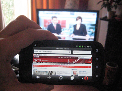
Photo borrowed from Chris Mills by kind permisson
In certain ways a TV screen is about as large as a phone or tablet screen. It’s bigger in centimeters, but it’s also further away from your eyes, and as a result it shouldn’t have a desktop screen resolution. The Samsung TV fails spectacularly here: text in responsive designs, and even old-fashioned 1024px-based ones, will be absolutely unreadable from standard TV-viewing distance when the total site width is 1280px.
I experimented with the zoom settings, and found that at 980px the text was still too small, but at 640px it was slightly too large. I’d say 768px (iPad portrait) would be in the right ballpark for this particular TV. A small tablet size, in other words. Patrick Lauke told me this ages ago, and now I’ve seen it for myself.
Incidentally, this gives us an argument for using a meta viewport width value other than device-width. If it were vital for my project to support this TV I’d use a browser detect, switch the meta viewport width value to 768, and hope the user has “Adapt to screen” selected. In fact, I think I’d do this for any TV browser. It can’t hurt, though it may not help.
Finally a few random items:
screen.width/height always gives the physical screen dimensions, and not the ideal viewport size, even when the correct zoom option is checked. Chrome on Android gives the ideal viewport size, but then this browser is likely based not on Chrome on Android but on Chrome on Linux.From my first test it’s clear that the major problems with this Samsung TV (and likely many others) are the lousy interface and lack of support for a 768-ish ideal viewport that will allow text to be read from TV-viewing distance. Until the browser makers solve these issues consumers don’t have the slightest incentive to browse on their TVs, which saves us the trouble of using browser detects. Win-win.
Now that I’ve written this down I have plenty of ideas for more tests, and I have to feed my friend’s cat several times more. So I’ll likely publish a new set of findings later on.
This is the blog of Peter-Paul Koch, web developer, consultant, and trainer.
You can also follow
him on Twitter or Mastodon.
Atom
RSS
If you like this blog, why not donate a little bit of money to help me pay my bills?
Categories: