Yesterday John Gruber wrote about the upped pixel density in the upcoming iPhone (960x640 instead of 480x320), and why Apple did this. He also wondered what the consequences for web developers would be.
Now I happen to be deeply engaged in cross-browser research of widths and heights on mobile phones, and can state with reasonable certainty that in 99% of the cases these changes will not impact web developers at all.
The remaining 1% could be much more tricky, but I expect Apple to cater to this problem by inserting an intermediate layer of pixels. (Later John pointed out that such a layer already exists on Android.)
One caveat before we start: because they’re unimportant to web developers I have mostly ignored the formal screen sizes, and I’m not really into disucssing the ins and outs of displays, pixel densities, and other complicated concepts. So I might use the wrong terminology here, for which I apologise in advance.
I do know what web developers are interested in, however. They need CSS pixels. That is, the “pixels” that are used in CSS declarations such as width: 300px or font-size: 14px.
These pixels have nothing to do with the actual pixel density of the device, or even with the rumoured upcoming intermediate layer. They’re essentially an abstract construct created specifically for us web developers.
It’s easiest to explain when we consider zooming. If the user zooms in, an element with width: 300px takes up more and more of the screen, and thus becomes wider and wider when measured in device (physical) pixels. In CSS pixels, however, the width remains 300px, and the zooming effect is created by expanding CSS pixels as much as is needed.
When the zooming factor is exactly 100%, one CSS pixel equals one device pixel (though the upcoming intermediate layer will take the place of device pixels here.) The image below depicts that. Not much to see here, since one CSS pixel exactly overlaps one device pixel.
(I should probably warn you that “zoom 100%” has little meaning in web development. Zooming level is unimportant to us; what we need to know is how many CSS pixels currently fit on the screen.)
The following two images illustrate what happens when the user zooms. The first shows device pixels (the dark blue background) and CSS pixels (the semi-transparent foreground) when the user has zoomed out. The CSS pixels have become smaller; one device pixel overlaps several CSS pixels. The second image shows device and CSS pixels when the user has zoomed in. One CSS pixel now overlaps several device pixels.
Thus our element with width: 300px is always exactly 300 CSS pixels wide, and how many device pixels that equals is up to the current zooming factor.
(You can calculate that factor by dividing screen.width by window.innerWidth — on the iPhone. Browser incompatibilities are rife here; expect a full report in the not-too-distant future. Besides, as a web developer you’re not interested in the zooming factor, but in how many pixels (device or CSS) fit on the device screen.)
This system will not change. If it did, all iPhone-optimised sites would become severely un-optimised in a hurry, and that’s something Apple wants to prevent at all cost.
Thus, a fully zoomed-out website would still display at 980 CSS pixels, and how many device pixels that equals is unimportant to us.
However, there are two tricky bits: the device-width media query and the <meta name="viewport" width="device-width"> tag. Both work with device pixels, and not with CSS pixels, because they report on the context of the web page, and not on its inner CSS workings.
The device-width media query measures the width of the device in device pixels. The width media query measures the total width of the page in CSS pixels, which, for reasons I’ll explain later, is at least 980px on the iPhone.
The device-width media query works as follows:
div.sidebar {
	width: 300px;
}

@media all and (max-device-width: 320px) {
	// styles assigned when device width is smaller than 320px;
	div.sidebar {
		width: 100px;
	}

}
Now the sidebar is 300 CSS pixels wide, except when the device width is 320 device pixels or less, in which case it becomes 100 CSS pixels wide. (You stil follow? This is complicated.)
By the way, in theory you could use a media query that queries the device screen in centimeters or inches (@media all and (max-device-width: 9cm)). Unfortunately it seems badly to outright unsupported, even by the iPhone. The problem here is that physical units such as inches are usually translated to (CSS) pixels; thus width: 1in equals 96 pixels on all browsers I tested so far (and that’s quite a few). So these media queries are unreliable.
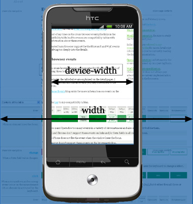
<meta> tagIn general <meta name="viewport" content="width=device-width"> is even more useful. This tag, originally Apple-proprietary but meanwhile supported by many more mobile browsers, actually makes the layout viewport fit the device exactly.
Now what is the layout viewport? It’s the area (in CSS pixels) that the browser uses to calculate the dimensions of elements with percentual width, such as div.sidebar {width: 20%}. It’s usually quite a bit larger than the device screen: 980px on the iPhone, 850px on Opera, 800 on Android, etc.
If you add <meta name="viewport" width="device-width">, the width of this layout viewport is constrained to the device width in device pixels; 320 of them in the iPhone’s case.
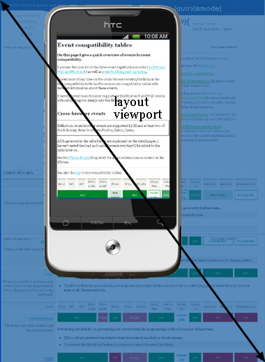
That matters if your pages are narrow enough to fit in the screen. Take this page without any CSS width statement and without the <meta> tag. It stretches over the full available width of the layout viewport.
This is probably not what you want. You want to fit the text nicely on the screen. That’s the task of <meta name="viewport" width="device-width">. When you add it, the layout viewport is contracted (to 320px in the case of the iPhone), and the text fits.
Now what impact will Apple’s resolution changes have on the device-width media query and the <meta> tag? Of course I cannot be certain, but I expect that nothing will change for web developers.
<meta> tagThe <meta> tag is easiest to explain. Apple has deliberately invented it precisely in order to allow people to fit their content on an iPhone screen, and has pushed it with developers. That means that it can’t afford to change the device width as read out by the <meta> tag now.
In fact, the Nexus One has already blazed a trail for Apple to follow. Its official screen width (in portrait mode) is 480px, but when you apply the <meta> tag it acts as if the screen width is 320px, 2/3rds of the official width.
If I understand correctly, this is what John Gruber is saying when talking about the Nexus’s display and its missing one sub-pixel and thus 1/3rd less pixels. That fits the Nexus interpretation of the <meta> tag exactly.
So basically Google has already inserted a layer of what are apparently called dips; device-independent pixels. This layer comes between the official, reported screen size and the CSS pixels web developers work with.
I expect the new iPhone to copy the Nexus trick and report the screen size as 320px (half of the formal resolution, in other words) when queried by the <meta> tag. It’s half and not two-thirds because the pixel density of the new iPhone is higher than the Nexus (or something).
That leaves the device-width media query as the sole problem area. On the Nexus it uses 480px as the screen width, despite the fact that here, too, 320px may be more appropriate. We’ll have to see what Apple does here.
The more fundamental question is whether the dips are also going to be used for media queries. On the whole I’d say we want that; formal device size is unimportant to web developers: we want to know how much content we can get on the screen, and it seems dips are most suited for that.
Unfortunately the Nexus does not do that right now; as far as media queries are concerned the device-width is still 480px, and not 320px. But maybe Apple can solve this problem for web developers.
So the situation is quite clear for normal websites and for those that use the <meta> tag; less clear when it comes to media queries.
Stay tuned.
This is the blog of Peter-Paul Koch, web developer, consultant, and trainer.
You can also follow
him on Twitter or Mastodon.
Atom
RSS
If you like this blog, why not donate a little bit of money to help me pay my bills?
Categories:
Comments are closed.
1 Posted by Eric Meyer on 20 April 2010 | Permalink
Yep. I was thinking about writing something similar, but as usual you've gone way more detailed and intelligent than I would've been. Thank you!
And I bet that, right now, the editors of several web design magazines are softly weeping that they didn't have a chance to publish this as an article on their sites.
2 Posted by bruce on 20 April 2010 | Permalink
If I read that really slowly in a dark room and don't speak, I understand it. The moment I think about dinner, scratching an itch or the phone rings, all the information falls out of my head and I have to read it again.
Your explanation is great. The subject matter makes my cortex sob.
3 Posted by kL on 20 April 2010 | Permalink
Gruber was talking about AMOLED RGB layout trick, which has nothing to do with CSS pixels or even device pixel as-seen-by-the-OS.
AMOLED doesn't have even number of R, G and B subpixels. It has array of RG and BG pixels.
So on Nexus1 you get 800 device pixels if your picture is green, but 400 device pixels if it's red (and it's rougly estimated to equal 2/3rd of resolution when you use all colors).
4 Posted by ll on 20 April 2010 | Permalink
thanks for the article but you need to make some important grammar changes.
4th paragraph down from "what web developers need" you have both diagrams specifying zoomed out when one is clearly zoomed in.
3rd paragraph down from "tricky bits" you mean width not with, the grammar can throw the whole sentence off
5 Posted by Sasha Sklar on 20 April 2010 | Permalink
I'm glad you're starting to dig into this. The viewport meta tag in general and width="device-width" in particular seems to be a big source of confusion.
There really needs to be the same kind of fundamental research and instructional writing that was done when the switch from table layout to CSS-P occurred.
Developers need to know both how it's supposed to work and how it actually works in current user-agents.
6 Posted by Andrew Hedges on 20 April 2010 | Permalink
@PPK, another elucidating article. Thank you. Can you comment on @kl's remark about AMOLED? If I understand correctly, it shouldn't make a difference, because the number of CSS pixels we have to work with will remain the same (that is, the system will abstract away the difference between a green screen and a red screen). Is that right?
7 Posted by ppk on 20 April 2010 | Permalink
@Andrew: you're correct. I don't really.understand the comment but it certainly doesn't have anything to do with web development. What happens outside our abstraction layer is not important to us.
8 Posted by Domenic Denicola on 20 April 2010 | Permalink
Wow. I rarely comment on articles unless I have a question, but this one was so elucidating that I just had to stop by and say "thanks." Really, great job summarizing this stuff; it will make my life much easier when I finally get around to writing those mobile apps I have planned.
9 Posted by Jonathan Kemp on 20 April 2010 | Permalink
Would pt instead of px be an acceptable unit of measurement in CSS? It is already a part of the spec. The question, I guess, is what size browser vendors assign to it. If it is not equivalent to px, then you could just convert.
10 Posted by Fabio Mazarotto on 20 April 2010 | Permalink
What happens with images in this case?
Should I use higher res images in elements with the dimensions of the latter just a fraction of the true image?
One more thing: is there any relevance projects like textorize and other stuff that uses subpixel anti-alias?
11 Posted by Ryan Cannon on 21 April 2010 | Permalink
I find this comment odd:
> as a web developer you’re not interested in the zooming factor,
> but in how many pixels (device or CSS) fit on the device screen
If apple does release a 960x480 resolution iPhone (300+ ppi) this summery alongside their 1024x768 iPad (132ppi), won't the zoom level be vitally important?
In the (albeit limited) work that I've done so far, I've found width=device-width trickier to work with among devices with different display sizes.
12 Posted by Ross Olson on 21 April 2010 | Permalink
@Jonathan: You've missed a foundational concept here that ppk glossed over a bit. Pixels are an acceptable measure here, but remember that a CSS pixel is NOT a physical screen pixel by definition. A CSS pixel is a 'relative' measurement, just like the CSS point measurement. It's just that now, we are starting to see displays that have high enough pixel densities to make the difference meaningful. Welcome to the future?
13 Posted by Allen on 21 April 2010 | Permalink
Ryan: Choosing a viewport that works well on both iPhone and iPad content can be tricky; check this out for some one-liners that work:
http://antipode.ca/2010/choosing-a-viewport-for-ipad-sites/
14 Posted by melgross on 21 April 2010 | Permalink
The reported resolution here for Apple's new iPhone, is incorrect. It is 960 x 640, not 960 x 480, assuming that the rumors are correct, of course. That's why it would be .5 with Apple but 2/3 with Android.
15 Posted by Nate on 21 April 2010 | Permalink
Great article! Fairly minor note -- you've reproduced an error of Gruber's. The new screen is (purported to be) 960x640 pixels, not 480. Double the current screen in both directions.
16 Posted by Ronald Northrip on 21 April 2010 | Permalink
I would like to make the following proposal — DPI should be dynamic and pixels should be based on that dynamic value. Hey HTML5/CSS3+ monkeys and browser implementers I hope you’re listening.
My premise is simple: the DPI value is simply a multiplier for anything set in pixels so that the resulting dimension is scaled appropriately regardless of the displaying device’s true resolution.
Why can’t we add a tag/meta tag to HTML5 that allows us to set the DPI resolution for our page? Why can’t we set it as an attribute of the BODY tag? Why can’t we set it with a style sheet? Why can’t we expose this to JavaScript? I’m just asking.
In fact, if implemented intelligently, there is no reason we couldn’t mix different DPI blocks within a larger scale. Its just a multiplier.
17 Posted by Lim Chee Aun on 21 April 2010 | Permalink
I had a thought few days ago that web developers should start using absolute units like mm or in. I wonder if this could fix this problem...
18 Posted by GreLI on 21 April 2010 | Permalink
In this case pixel independent values must be used such as pt or cm. This is what it developed for. And vector graphics should also be preferred such as SVG (I hope those webkits were smart enough to understand it). So we are now at the beginning of pixel graphics dying and developers must be aware of it.
How about HTC HD2? There is also high pixel density.
19 Posted by Florent V. on 21 April 2010 | Permalink
Ideally, “CSS pixels” should be an internal mechanism used by web browsers and devices for compatibility with older layouts, which we should’t have to even think about or understand (kinda like hasLayout, uh). And we should be dealing with a mix of proportional units and absolute units such as points (pt).
Some web browsers are able to display REAL points as long as the OS tells them what the screen's DPI are. I know that Firefox is able to do that. See:
http://kb.mozillazine.org/Layout.css.dpi (default value is -1)
On OS X Snow Leopard, it seems the system is reporting 96 as the screen's DPI, whatever the screen is. Previous versions reported 72. Windows reports (used to report?) 96. Linux seems to be the only OS reporting the real value, and not a fixed convention. It accurately reports 112dpi on my laptop, for instance. This actually breaks some sites that use pixels for some elements, points for others, and expect a conventional 96dpi factor. For instance, text in Google Docs' presentations doesn't render correctly because of that on Linux+Firefox (unless you manually set layout.css.dpi=96).
This is frustrating. We should be able to do media queries with in, cm or pt.
20 Posted by Ronald Northrip on 21 April 2010 | Permalink
@Florent V. - The broken layout that you see because Firefox accurately acknowledges DPI differences is precisely why we need a DPI control in HTML5/CSS3. This would allow us as designers to provide a device for conveying to the browser/renderer what we were assuming as normal resolution.
Browsers could and should assume 96dpi for backwards compatibility.
This isn't rocket science.
Size=DPI x Pixels
Please, is anyone listening?
21 Posted by Florent V. on 21 April 2010 | Permalink
@Ronald, in CSS the “physical” units such as pt, cm or in are called absolute units because they're supposed to have a precise physical size. Current OS+browser combinations don't honor this, and for historic reasons stick to a mapping from these units to device pixels, pretending the resolution is 96dpi.
What you're calling for is for designers to be able to change the mapping ratio—96 dpi—to whatever they want. I must say i don't see the point. I'd rather have accurate physical units, i.e. a mapping ratio depending on the device's resolution.
What's the use case for changing the mapping ratio, or even for using pt or cm or in at all when they (wrongly) map to pixels? The Google Docs example i was referring to is not a use case, it's a bug; they want a precise number of pixels, so they should be using the px unit.
22 Posted by Christopher Brown on 21 April 2010 | Permalink
Great read. And so glad not to come across the term 'non-square pixel' anywhere in the text. Made my day.
23 Posted by Matt Brubeck on 23 April 2010 | Permalink
I'm on the Mobile Firefox team and I am just starting to tackle this issue, along with other fixes to our meta viewport handling. Here's the bug I just filed for the pixel density issue:
https://bugzilla.mozilla.org/show_bug.cgi?id=561455
I welcome any input on this. If you don't want to post it directly to Bugzilla, you can reach me at mbrubeck@mozilla.com.
24 Posted by Matt Brubeck on 24 April 2010 | Permalink
"The device-width media query measures the width of the device in device pixels."
I think this is incorrect. "device-width" is specified as a "length" value, and when you compare it to a CSS length like "800px" or "10cm" then those lengths must be interpreted as defined in CSS.
The current CSS3 Media Queries recommendation even notes specifically in its device-width example, "The ‘px’ unit is of the logical kind, as described in the Units section."
If it's true that the Android browser reports physical pixels rather than logical pixels in media queries, then I think that is a bug. And it will definitely make interoperability harder with other browsers on similar (physical) screen sizes.
25 Posted by Max Smart on 27 April 2010 | Permalink
Use percents and ems. Imaginary problem solved, move along.
26 Posted by Andreas Windt on 29 April 2010 | Permalink
i don't see it mentioned before, but i think that viewport meta tag should read content="width=viewport-width" (with "width=viewport-width" as the value of the meta tag's content attribute) - it will not work otherwise.
27 Posted by Andreas Windt on 29 April 2010 | Permalink
my mistake, i meant "width=device-width" ;)
sorry
28 Posted by Dan Fabulich on 10 May 2010 | Permalink
The Android team has implemented a custom meta viewport property to address this problem called "target-densityDpi" ... it's totally undocumented, though. You can read more about it in the check-in comment here: https://android.git.kernel.org/?p=platform/external/webkit.git;a=commit;h=f10585d69aaccf4c1b021df143ee0f08e338cf31