
Blog homepage RSS feed Mastodon Bluesky About me
This blog uses a new RSS feed. Please update the old QuirksBlog feed you used to follow.
October 2026 2 September 2026 3 August 2026 2 May 2026 6 April 2026 9 2004-2021 blog
Today, for the first time in ten years, I bought a test phone (a second-hand Galaxy S21) and worked on creating my first mobile browser test array in nine years. Here’s a few fun facts that I noticed.
My array consists only of one iPhone and one Galaxy — quite a difference with the past, when I routinely used about twelve to fifteen devices.
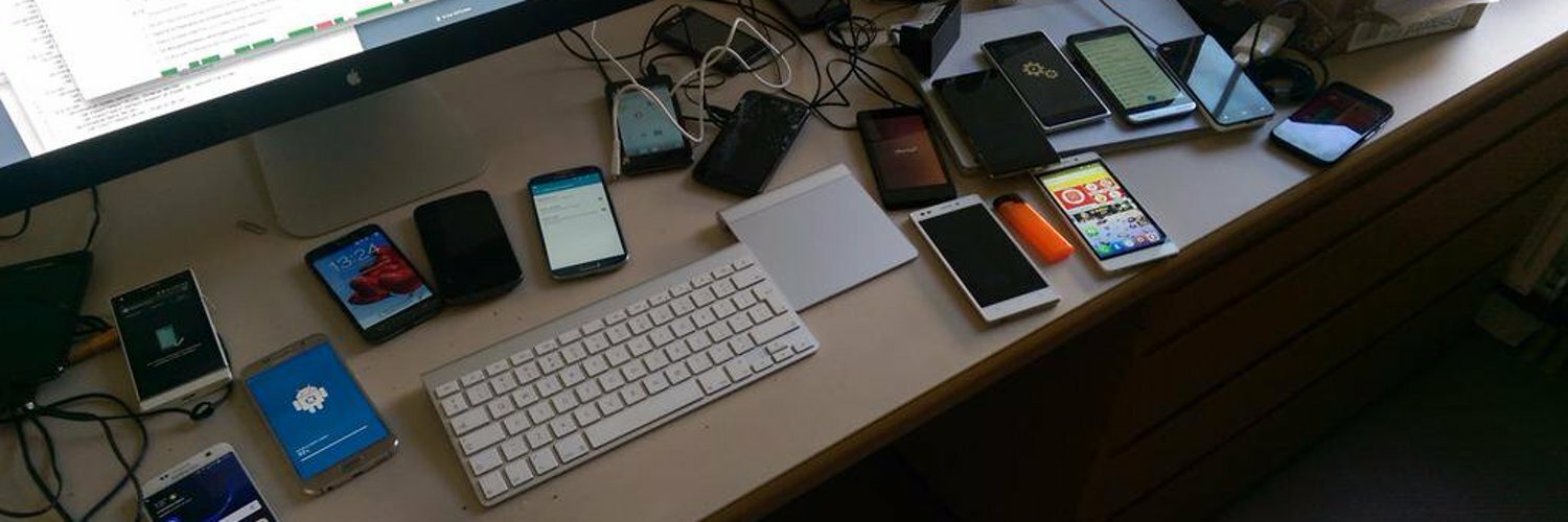
Still, let’s start small. The phone market is simpler than back in 2012. And these two phones have one advantage I thought I’d never have: they use the same charger!!!! I thoughtlessly switched the charger from Galaxy to iPhone. And! It! Worked! 2012 would not believe you.
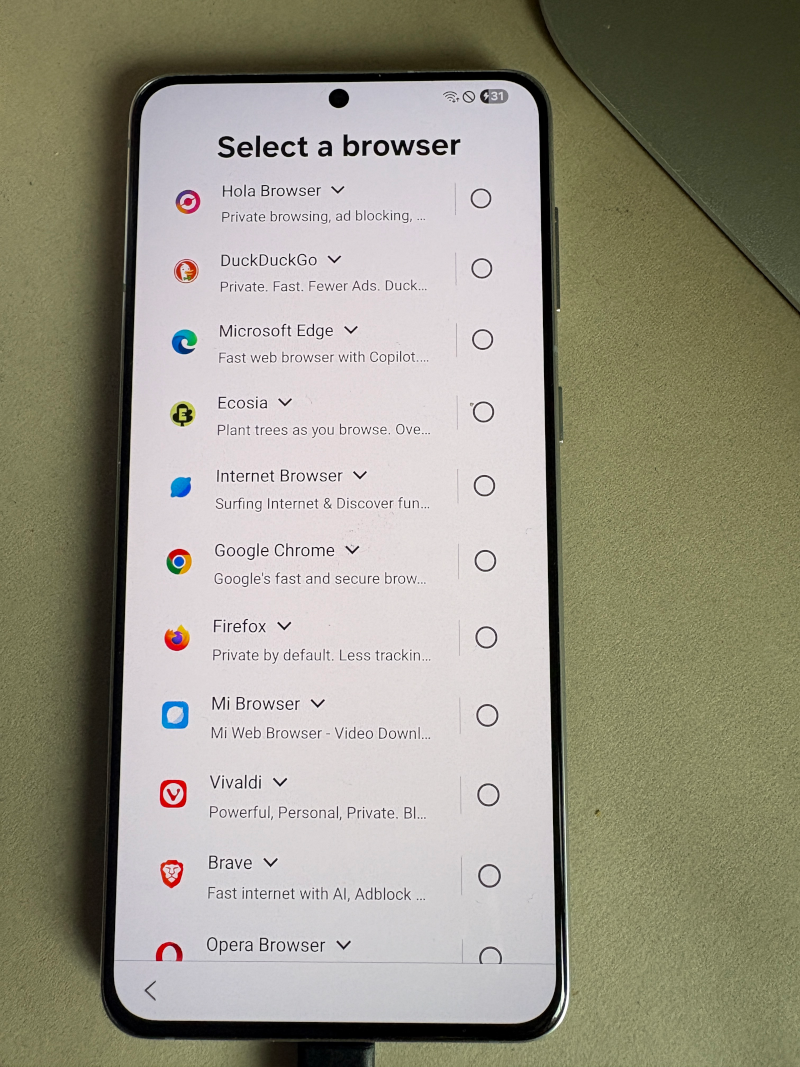
The Galaxy has a browser/search engine choice menu nowadays. That’s fair, I’d say, given that the iPhone has one as well. Both these lists are very long, and that will likely put off consumers. That’s the point of such long lists.
Anyway, I knew what I wanted on my Galaxy. Chrome, Samsung Internet, UC, Firefox, Vivaldi. The first two were already on it. The others required use of the Play Store, which, incidentally, doesn't have a search bar by default any more. Sure, there’s a menu item, but it’s not the same. (A search bar by default might be a useful feature for the EU to require. Consumers must have choice.)
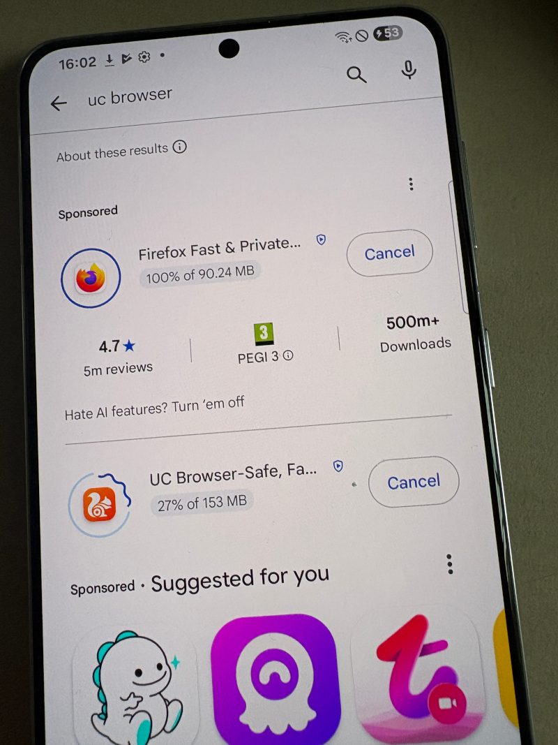
When I’d found UC I also saw Firefox. Cool, two downloads in one screen. Then I looked further and saw that Firefox was a sponsored result. Same when I searched for Vivaldi. Clearly, someone at Mozilla bought a bunch of good keywords.
Coolest feature last. It turns out that UC supports zoom reflow. That is, when you resize the visual viewport, the text adapts to the new width and fits snugly.
This used to be an HTC thing back in the days (but today nobody remembers HTC). Now, apparently, it’s a UC thing.
The downside of this feature is that it must be very expensive in terms of reflowing the page. I don’t doubt that there will be exceptions and things where the page doesn’t reflow. But I discovered it only an hour ago, so I will bask in the radiance of my absolute favourite mobile feature returning from the dead. Difficult questions will have to wait for tomorrow.
