
Today we will look at fit-content and fit-content(), which are special values for width and grid definitions. It’s ... complicated — not as a concept, but in its practical application.
I'm writing a CSS book.
Before looking at fit-content we have to briefly review two other special width values: min-content and max-content. You need those in order to understand fit-content.
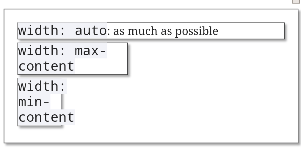
Normally (i.e. with width: auto defined or implied) a box will take as much horizontal space as it can. You can change the horizontal space by giving width a specifc value, but you can also order the browser to determine it from the box’s contents. That’s what min-content and max-content do.
Try them below.
width: auto: as much as possible
width: max-content
width: min-content
width: max-content with a long text that runs the danger of disappearing right out of the browser window if it continues for much longer
min-content means: the minimal width the box needs to contain its contents. In practice this means that browsers see which bit of content is widest and set the width of the box to that value. The widest bit of content is the longest word in a text, or the widest image or video or other asset.max-content means: the width the box needs to contain all of its contents. In the case of text this means that all text is placed on one line and the box becomes as wide as necessary to contain that entire line. In general this is not a desirable effect. The largest bit of content may also be an image or video other asset; in that case browsers use this width to determine the box’s width.If you use hyphens: auto or something similar, the browser will break the words at the correct hyphenation points before determining the minimal width. (I turned off hyphenation in the examples.)
All Chromium-based browsers on Android (tested in Chrome (v90), Samsung Internet (v87), and Edge (v77)) break off the 'width: max-content' text in the example above at the dash, and thus take the 'width: max-' as the max-content, provided the page does NOT have a meta viewport. No other browser does this — and that includes Chrome on Mac.

Also, Chromia on Android make the font-size a tad smaller when you resize the boxes below the maximum possible width. I will ignore both bugs because this article is about fit-content, and not about these rabbit holes.
These bugs do NOT occur in UC (based on Chromium 78). Seems UC is taking its own decisions here, and is impervious to these particular bugs.
Now that we understand these values we also understand fit-content. It is essentially a shorthand for the following:
box {
	width: auto;
	min-width: min-content;
	max-width: max-content;
}
Thus the box sizes with its containing box, but to a minimum of min-content and to a maximum of max-content.
width: fit-content: trying to find my fit
min-width: fit-content
max-width: fit-content
I’m not sure if this effect is useful outside a grid or flexbox context, but it’s here if you need it.
You can also use fit-content as a min-width or max-width value; see the example above. The first means that the width of the box varies between min-content and auto, while the second means it varies between 0 and max-content.
I find this fairly useless and potentially confusing. What you really mean is min-width: min-content or max-width: max-content. If that’s what you mean, say so. Your CSS will be clearer if you do.
So I believe that it would be better not to use fit-content for min-width or max-width; but only for width.
fit-content also works in flexbox and grid. The middle box in the two examples below sizes to its content.
A caveat for flexbox: don’t use flex-grow: 1 or any other value above 0; this gives the box permission to size beyond its calculated width, and the fit-content effect is lost.
fit-content
And in grid
fit-content
Let’s go to the more complex part: fit-content(). Although it’s supposed to work for a normal width, it doesn’t.
width: fit-content: trying to find my fit
width: fit-content(200px)
You can use fit-content(value) in grid templates, like:
1fr fit-content(200px) 1fr
fit-content(200px)
It means
1fr min(max-content-size, max(min-content, 200px)) 1fr
The max() argument becomes min-content or 200 pixels, whichever is larger. This is then compared to the maximum content size, which is the actual width available due to the constraints of the grid, but with a maximum of max-content. So the real formula is more like this one, where available-size is the available width in the grid:
1fr min(min(max-content,available-size), max(min-content, 200px)) 1fr
Some syntactic notes:
fit-content() the function here. fit-content the keyword does not work in grid definitions.fit-content() needs an argument; an empty function does not work. Also, an argument in fr units is invalid.fit-content(stretch). It does not work anywhere, and isn’t referred to anywhere else. I assume it comes from an older version of the spec.I tested most of these things in the following example, where you can also try the bits of syntax that do not work — maybe they’ll start working later.
And that’s fit-content and fit-content() for you. It’s useful in some situations.
Below you can play around with fit-content() in a grid.
Set grid-template-columns: to
fit-content() with some more text
I'm writing a CSS book.
This is the blog of Peter-Paul Koch, web developer, consultant, and trainer.
You can also follow
him on Twitter or Mastodon.
Atom
RSS
If you like this blog, why not donate a little bit of money to help me pay my bills?
Categories: