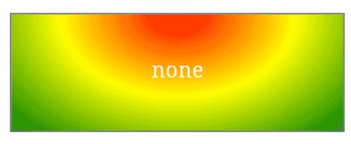

Another fine day at the QuirksMode test labs, where we test browsers so you don’t have to. Today’s topic is CSS gradients, and the subtle ways in which the various Android devices fuck them up. Also, the not-so-subtle ways in which Android devices fuck up screenshots of said gradients.
It turns out that there are differences between gradients on the various Android devices. This is not a browser thing, but an actual device thing. I compared the same gradient test on different Android devices in Firefox, Android WebKit, and Chrome, and found the same differences between the browsers. It became obvious that there are incompatibilities between these Androids’ graphical ... thingies, and that browsers don’t (can’t?) work around them.
So I thought I’d write a snarky post embellished with some screenshots. It was when I had made those screenshots that the other shoe dropped: the screenshots show different gradients than the screen. In other words, Android screenshots cannot be trusted to show subtle browser differences. Actual external pictures taken with a camera are mandatory.
This is all so marvelous. No wonder I can’t quit smoking.
Compare the following two pictures and ponder the differences. Both show the first test on this page in Chrome 39 for Android on the Sony Xperia S.
The first one is a screenshot taken with the Xperia itself. It shows the more-or-less correct gradient. However, it doesn’t actually match what the device shows on-screen.

The second one is taken with an external camera. It shows what I see on-screen, and it’s clear that the gradient is subtly different from the one in the screenshot. The yellow doesn’t form a narrow band, and the gradient from red to orange takes much less space.

The first picture matches what I see in desktop browsers and most other Android devices. The second picture matches what Xperia users will actually see. How much of a problem this is depends on the site’s graphic design and the exact gradients you use, but it’s a problem you should be aware of.
Hell, let’s do another one. Here is the same test case, again in Chrome 39, but now on the LG L5. First the screenshot, then the external camera.

Again, there is a subtle difference between the gradients, though it’s less pronounced than with the Xperia. Again, the screenshot matches the other browsers much better than what’s actually on the screen.

It seems clear that the screenshot app uses a different graphical ... thingy than the screen and/or browser. The screenshot app gets the correct gradients, while the browser window on the screen does not. Again, this is a device problem, and not a browser problem. Firefox, Android WebKit, and Chrome show roughly the same gradient on each device, and the same differences from device to device.
Since I don’t know anything about Android’s graphical thingies I cannot solve this riddle. Just be aware that there are gradient problems on Android, and also screenshot problems on Android. Wonderful, marvellous.
Now if you’ll excuse me I’ll go and drink myself into a stupor.
Update: The consensus among those who commented on this article is that the device's screens are badly calibrated. So far it seems LG and Sony are affected, but Samsung and HTC are not.
The fundamental issue is that a specific RGBA colour value looks different on different physical displays, but the screen buffer is generated without taking into account the properties of the display.
(Eli Fidler, BlackBerry)
The real point here is that Android screenshots (and remote testing solutions that depend on them) are not reliable enough for web developers to use.
Update 2: See this new article for some more information.
This is the blog of Peter-Paul Koch, web developer, consultant, and trainer.
You can also follow
him on Twitter or Mastodon.
Atom
RSS
If you like this blog, why not donate a little bit of money to help me pay my bills?
Categories: