Web developers are quite annoyed that position: fixed doesn’t work on mobile browsers, but mobile browser vendors cannot afford to support it. This dilemma is unsolvable by the means we presently have at our disposal.
To offer a way out, I’m proposing to create a new position: device-fixed declaration better suited to the mobile scenario with its tiny screen and its zoom. The zoom aspect, in particular, is completely ignored by the spec, and so far mobile browsers haven’t found a good solution, either.
With a new value, fixed positioning could be split into a desktop and a mobile variant, and browsers could decide which one to support. That would allow web developers to devise separate solutions for desktop and mobile.
The fundamental problem is that the mobile and desktop use cases of the fixed element are radically different.
On the one hand, the fixed element’s content must be terse and to-the-point on the tiny mobile screen, while it can be much more sprawling on a desktop screen.
On the other hand, the fixed element’s content is likely to be more important on mobile than on desktop. If you occupy a sizable chunk of a small screen, you’d better occupy it with something important. Conversely, because there’s so much space available, desktop fixed elements are usually filled with lots of little extras (that, quite frankly, are rarely interesting).
Until now web developers have opted for the desktop approach. But fixed elements designed for the desktop are far too large for the tiny mobile screen, and some information will bleed out of the element. Thus the user will not be able to see, much less read, the information. Scrolling doesn’t help: the element is fixed, and will stubbornly stay in its position.
If mobile browsers were to implement position: fixed exactly as the desktop browsers do, many sites with fixed elements would become unusable on mobile. Therefore most mobile browser vendors have ignored a large part of the spec. From a practical perspective they’re right, even though position: fixed as specified could work on mobile.
The CSS 2.1 spec defines position: fixed as follows:
Fixed positioning is a subcategory of absolute positioning. The only difference is that for a fixed positioned box, the containing block is established by the viewport. For continuous media, fixed boxes do not move when the document is scrolled. In this respect, they are similar to fixed background images.
Spec and mobile reality are diverging at a brisk pace. The “fixed boxes do not move” requirement has been ignored by most mobile browsers. On the other hand, the specification ignores zooming.
And what is the viewport? On desktop browsers it’s the browser window, and as a result fixed positioned elements are placed relative to the window, and don’t move when the document is scrolled. We all know that, and we want it on mobile.
Mobile browsers, however, have two viewports: the visual one and the layout one. Relative to which viewport do browsers position the fixed element?
Nobody will be particularly surprised to hear that this depends on the browser. The vast majority has opted for the layout viewport, with only Nokia WebKit dissenting. You can test your browser at this test page. See also the inevitable compatibility table.
The difference between the two positioning schemes can be visualised best if we give the fixed element a bottom: 0. Thus it is aligned at the bottom of whatever box it is positioned relative to.
This is an element fixed relative to the visual viewport:
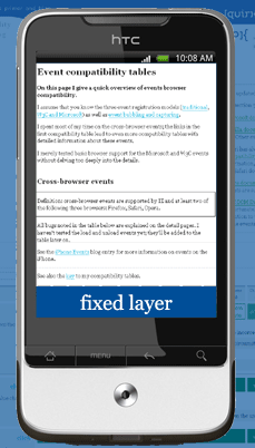
The fixed element is positione at the bottom of the page and stays there when the user scrolls, just as on the desktop.
Although it’s clear that this is the most accurate porting of the desktop effect to mobile, of all the myriad mobile browsers only Nokia WebKit implements it — and then not even in all circumstances. As we already discussed, fixing elements designed for the desktop relative to the tiny visual viewport is just not very useful on mobile.
What happens when the user zooms? The Nokia N8 removes the fixed element entirely; and we can all agree that’s not the best possible behaviour. But what should happen? I have no clue. Browsers can’t handle the situation, and the spec is silent.
Other browsers, notably Safari on iOS, decided to position the fixed element relative to the layout viewport, and scroll them with the document. Thus they ignore an important part of the specification.
(Essentially this makes position: fixed equal to position: absolute: absolute elements are positioned relative to the layout viewport if they don’t have an ancestor with position: relative. Open the test page in a desktop browser to see what I mean.)
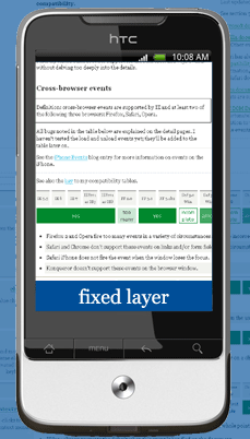
The fixed element with bottom: 0 is placed at the bottom of the layout viewport, and scrolls with the page. Thus its fixed nature is lost, but it remains fully readable because it scrolls and zooms with the rest of the page.
This solution is not perfect, either. The fixed element may cover crucial page content. Designers make sure that absolute elements don’t cover anything, but they will likely forget to do the same for fixed elements because they assume the user can always scroll a bit. If a fixed element scrolls with the page, though, the information underneath it will never be uncovered.
Still other browsers, notably Opera Mobile and BlackBerry WebKit, try to combine the two approaches. They initially position the fixed element relative to the layout viewport, but when the user scrolls the element “hops” to a new position at the bottom of the current visual viewport. It remains at this new position until the user scrolls again, after which they “hop” again.
The problem is that the “hop” only takes place about half a second after the user has stopped scrolling. This makes the effect a bit weird: stuff appears to change without any user command. (The command was of course the scrolling, but that’s not at all apparent to the average user) Still, this avoids any problems due to the fixed element covering vital information.
And what about zoom? Opera Mobile takes the most sensible position: while the user is zoomed in the position of the fixed element does not change at all. This allows the user to inspect it. It only starts “hopping” again when the user has zoomed out.
In contrast, BlackBerry WebKit tries something complicated to keep the element in view, but the effect is buggy. Sometimes the element just disappears, and at other times the positioning is off by a few pixels. And of course the content of the fixed layer grows so large that it bleeds out of the element and becomes unreadable.
Android is fragmented. My Nexus One with 2.2 uses the plain layout viewport solution, but my HTC Legend with 2.1 uses the hopping variation (buggily). I’m not sure if this is a 2.2 vs. 2.1 or a Google vs. HTC difference.
Samsung Dolfin, Android WebKit, Nokia WebKit, and possibly other browsers, change the handling of position: fixed when a <meta viewport> is added to the page. To preserve my sanity I did not research this aspect in depth, but it should be noted that my Nexus One implements true fixed positioning if you set <meta name="viewport" content="width=device-width, user-scalable=no" />; in other words, if you take away a goodly part of the user interaction.
Which of these solutions is the best? Having tested them extensively during several periods of research and in several test pages, I tend to think that none of them are particularly good.
Instead, I believe it’s time for position: device-fixed. It would be the fifth value for the position declaration, and the fact that it is a new value would solve the biggest problem at one stroke.
If mobile browsers would support device-fixed and desktop browsers would not, web developers could afford to create fixed solutions specifically for the one or the other.
position: device-fixed works like true fixed positioning in that the element is fixed relative to the visual viewport, and stays there no matter how the user scrolls or zooms.
In addition, CSS units used for the device-fixed element and its descendants are relative not to the CSS pixels of the layout viewport, but to the physical device pixels (or, if the device implements them, logical pixels). See this blog post for the three kinds of pixels.
Essentially this makes device-fixed elements unzoomable. That’s actually desirable. Zooming is pointless in this context because the content will bleed out of the device-fixed element and become unreadable. So why not suppress it altogether?
This no-zooming requirement is crucial. Without it, device-fixed elements are no different from fixed elements, and implementing the new value would be pointless.
I created a demo of the effect with JavaScript. Don’t forget to zoom. Performance is lousy; please pretend the effect is seamless.
This demo works only in Safari and BlackBerry WebKit, because only those browsers expose the dimensions of both the visual and the layout viewport, allowing me to calculate the zoom factor.
The idea is that desktop browsers do not support device-fixed, while mobile browsers stop supporting fixed. Thus web developers can create two effects, the fixed and the device-fixed, and be reasonably certain that the one works only on desktop, the other only on mobile.
What would happen with device-fixed elements on the desktop, or with fixed elements on mobile? They won’t be fixed, obviously, but will they be hidden entirely (display: none), or will they remain visible as any block-level element at their natural position on the page?
The old BlackBerry browser (4.6) already does something like that: it completely hides fixed elements.
What about tablets? Will they support fixed, device-fixed, or both? Right now I don’t know. Once both values are operational the tablets’ browser engineers will take an informed decision. The fact that there are two values ensures maximum flexibility.
The fact that device-fixed addresses a use case that could be handled by the current specification of fixed speaks against it, although the spec doesn’t address zooming at all and thus remains incomplete.
Still, web developers need true mobile fixed positioning — in fact, there’s considerable outcry over this very subject. At the same time, mobile browser vendors cannot afford to implement true fixed.
device-fixed offers a way out of this dilemma. It’s a practical solution first and foremost; I appreciate that from a theoretical point of view it’s less defensible.
So I’d like to ask the CSS wizards from W3C and the web development community, as well as the mobile browser vendors, to consider position: device-fixed.
Not that it will be easy to implement. I already mentioned a few details that will have to be worked out, and no doubt more will be found. I also wonder if making CSS units relative to something other than CSS pixels is simple.
One thing is certain, though: without position: device-fixed or a similar solution there will be no true fixed positioning on mobile.
This is the blog of Peter-Paul Koch, web developer, consultant, and trainer.
You can also follow
him on Twitter or Mastodon.
Atom
RSS
If you like this blog, why not donate a little bit of money to help me pay my bills?
Categories:
Comments are closed.
1 Posted by Jacob Rask on 7 December 2010 | Permalink
How about browsers implying a specific behavior on
@media handheld { .fixed { position: fixed; } }?
2 Posted by Julienw on 7 December 2010 | Permalink
There's more devices than only "mobile" and "desktop".
iPad run Safari Mobile; yet "position: fixed" should be supported there, thanks to the bigger screen. But it isn't, because of Safari Mobile.
That is just one current example, but I expect that new examples will come very soon.
The only solution I could think of is :
- if the browser is not "desktop": position: fixed === position: absolute
- if "position: fixed" is set in a media query, then always obey it.
and that's it.
It's a sort of "opt-in" solution that should work pretty good.
3 Posted by ppk on 7 December 2010 | Permalink
@media handheld is dead. In the past it was used to deliver very basic CSS to bad browsers, and as a reaction the good browser switched off support.
So handheld is not a part of the solution.
4 Posted by Jacob Swartwood on 7 December 2010 | Permalink
Can browsers express their blatant lack of support in a way that can be leveraged to adjust styles? like @media no-fixed {} and/or something in Javascript. This seems like a no-brainer if you are going to explicitly remove a feature that is part of the spec.
As my company has a mobile site, I only need a fix for tablets. I'm tempted to simply sniff UA for iPad etc., but that is obviously a terrible idea. I do have a better test (than similar tests used to catch IE6-) to catch webkit's lack of support for fixed...
function fixedSupport() {
var isSupported = false;
if (document.createElement) {
var el = document.createElement("div"),
rel = el.cloneNode(true);
if (el && el.style) {
el.style.position = "fixed";
el.style.top = "13px";
rel.style.position = "absolute";
rel.style.top = "23px";
var root = document.body;
if (root && root.appendChild && root.removeChild) {
rel.appendChild(el);
root.appendChild(rel);
if (!el.offsetParent || el.offsetParent.offsetTop > 0) {
isSupported = false;
} else {
isSupported = el.offsetTop === 13;
}
root.removeChild(rel);
}
}
}
return isSupported;
}
...but that feels sloppy. What do you suggest?
5 Posted by Jacob Swartwood on 7 December 2010 | Permalink
...I also wanted to note that I had thought of screen-size media queries, but lines are blurring between netbooks with real support (and no zooming) and tablets with mixed support (and zooming.) Using media queries just seems like another inaccurate assumption.
6 Posted by Collin Henderson on 7 December 2010 | Permalink
You can use simple JQuery to fix an elements position that works just fine on the mobile web.
Something like this function usually does the trick
function setHeight() {
var headerH = document.getElementById('header').offsetHeight,
footerH = document.getElementById('footer').offsetHeight,
wrapperH = window.innerHeight - headerH - footerH;
document.getElementById('wrapper').style.height = wrapperH + 'px';
}
7 Posted by romaxa on 7 December 2010 | Permalink
>similar solution there will be no true fixed positioning on mobile.
See:
https://bugzilla.mozilla.org/show_bug.cgi?id=607417
I have hackish patches which are making fixed-positioned elements working in Mobile Firefox (based on layers)..
So I'm pretty sure true support will be available in fennec/Firefox soon
8 Posted by Jose Pedro Arvela on 7 December 2010 | Permalink
My proposal is bringing back the handheld stylesheet to mobile browsers (or another @media therm as "mobile", for example, if modern mobile browsers still want to distinguish themselves from older mobile browsers).
On anything but mobile stylesheets, fixed positioning works as absolute, mobile ones, it works as the exemplified device-fixed.
At least that is how I think it would be ideal.
9 Posted by Milo on 7 December 2010 | Permalink
This hit my sanity filter:
"This no-zooming requirement is crucial. Without it, device-fixed elements are no different from fixed elements, and implementing the new value would be pointless."
If the difference between two "position" values is the way they are affected by zooming, something seems off. Perhaps a new "zoomable: false" solution would be better, simpler, and would have broader use.
I understand that "device-fixed" being new means nobody has to commonize on what "position: fixed" means, but, really? If everyone can agree on "position: device-fixed" surely they can also agree on "position: fixed" (+ "zoomable: false")?
10 Posted by Dan G. Switzer, II on 7 December 2010 | Permalink
The only issue I have w/the usage of a browser specific fixed position is that there's other issues that differ between desktop and mobile browsers.
Maybe the better solution is to add a doctype declaration to indicate if a page is actually designed for mobile viewing.
So you'd have doctype declaration like:
This way you've got an explicity way to indicate that the HTML has been designed for mobile platforms.
Then the browser can honor position:fixed w/the expectation the developer knows what the heck they're doing.
11 Posted by JokeyRhyme on 7 December 2010 | Permalink
Frankly, I do not see issues with existing websites as a problem large enough that the specification needs to be forked (fixed vs device-fixed) in order to deal with it. If your website is broken then you'll just have to fix it. Let's not complicate the future of the Internet just so a few web developers don't have to fine-tune. That's Internet Explorer talk, and it's crazy.
position:fixed just needs to work exactly the way it does on the desktop, end of story. Exactly what happens in case of zooming needs to be defined, and there we go.
12 Posted by James Pearce on 7 December 2010 | Permalink
I think 'device-' is the wrong prefix (& it's not the place of CSS to try to taxonomize hardware genres)
'screen-fixed' would work for me, though.
13 Posted by Brian Blakely on 7 December 2010 | Permalink
ppk,
Your version of "fixed" handles toolbars, but not things like modal boxes.
I love it for toolbars, though.
14 Posted by Jason Rhodes on 7 December 2010 | Permalink
@Collin the point is to understand the CSS implementation on mobile.
@Milo -- Brilliant. Count me in the zoomable: false; camp. It would also allow people to allow a fixed div to be zoomable, for style/artistic effect. Which is, you know, part of the point of CSS, right?
15 Posted by ppk on 7 December 2010 | Permalink
zoomable sounds nice, but it would be even more severaly restricted than my proposal.
zoomable: false only makes sense on (device-)fixed layers. In all other cases, the element itself would also become larger or smaller. If it didn't, the layout of the page would likely go totally out of whack, and that would *really* create some problems.
So zoomable could be an addition to position: device-fixed, but it's not an alternative to it.
16 Posted by Adrian Schmidt on 8 December 2010 | Permalink
I like the idea of being able to control fixed elements separately for desktops and devices.
I don't really see the problem with "there are more devices than just desktop and mobile". Maybe desktop and device are not the right words, but in this case there are only two kinds of devices; those who have only one viewport (like desktops), and those who use device and layout viewports (like mobiles).
Thus, the iPad should NOT implement the desktop version of position:fixed, because it uses two viewports to allow zooming. Rather, it should implement the new device (or whatever you'd like to call it) version of fixed.
17 Posted by Rubikzube on 8 December 2010 | Permalink
Zoomable: false seems rational to me considering that most devices, including desktops, are converging towards touch screens and it's a good mechanism for toolbars etc on web applications.
+1 for zoomable, defaulted to true.
18 Posted by tobi on 8 December 2010 | Permalink
I think mobile and desktop browsers should not go seperate ways.
Isn't zooming like scrolling in the y-axis?
So why not position:y-fixed?
Other, maybe crazy, ideas:
Thinking of future 3d display:
z-index:infinite
or
position:absolute;
width:200px;
height:200px;
depth:0; /* default -1000px ? */
19 Posted by Jacob Swartwood on 8 December 2010 | Permalink
What if we consider a zoomable property in a slightly different manner? Not in a way that designates it to zoom WITH the document, but instead independent of the document. (To avoid reflow insanity, developers could also apply overflow:auto.)
What about zoomable defaulting to false (except on the html or body tag)? When zoomable:true was applied to an element, and it was the target of a zoom or scroll event, it could cancel zoom(in)/scroll bubbling. When zooming out, if 100% (min-zoom) is reached bubbling applies again to the closest parent with zoomable:true. The last part would solve an issue of having a zoomed element expanded beyond width/height of the viewport.
This would allow developers "device-fixed" style positioning by manually setting zoomable:false on html (or body), placing fixed elements as children of the body, and setting zoomable:true and overflow:auto on a single "content" child of the body.
20 Posted by Jacob Swartwood on 8 December 2010 | Permalink
A clarification about my last suggestion:
All zooming would be stacked. A zoomable descendant would always be zoomed equivalent or greater than any zoomable ancestor.
21 Posted by tobi on 8 December 2010 | Permalink
sorry,
I correct my previous post, it should be:
Isn't zooming like scrolling in the z-axis?
So why not position:z-fixed?
22 Posted by Ryan Fioravanti on 8 December 2010 | Permalink
Re this comment:
my Nexus One implements true fixed positioning if you set ; in other words, if you take away a goodly part of the user interaction.
How can you say that setting this meta tag takes away good user interaction? Whenever somebody creates a mobile optimized website, the first thing they do is throw in that meta tag in order to improve the user experience. Without the meta tag the browser assumes that its looking at a website that has not been optimized for mobile, so there is no need to do anything other than make all the content accessible - which in the position:fixed case means just making it scroll inline with the rest of the content.
Android's Froyo web browser is the first to implement position:fixed on mobile, and does it when the mobile meta tag is included. I hope other mobile web browsers follow suit with this approach.
Note that even with the mobile meta tag included, zooming is still possible if you watch for gesture events and use transforms to change the scale on the element you want to zoom.
23 Posted by Ryan Cannon on 9 December 2010 | Permalink
The requirement for having part of the page not scale seems superfluous—if you're optimizing for mobile devices anyway, isn't it safe to assume the author also optimized text to be legible?
Also, your dichotomy between mobile/desktop doesn't pass my smell test as very future-proof.
IMHO, a desktop browser is defined as having a layout viewport equal to the visual viewport.
Rather than overload the position property, why not add a new property called viewport-attachment. The default value is "layout," but it can be set to "visual."
24 Posted by Karen Key on 9 December 2010 | Permalink
@Milo: zoomable:false seems also much better to me. But like device-fixed a little bit wrong, because it may be interpreted by designers just as a way to prevent the user to zoom a element.
@Ryan Cannon’s "viewport-attachment" seems to nail it. If a browser has only a "layout" viewport, than the value "visual" would be ignored and position:fixed would work oldschool. And if it has a visual viewport, the zooming problems would be fixed. Pun intended. :-)
Thanks @PPK for all the thoughts you published in the last month about the 2 viewports. I understood the nature of the fixing problem before, but never came up with a model of 2 viewports. Ryan Cannon’s "viewport-attachment" seems to fit perfectly in that model. It is backwards compatible and a designer can simply choose if his fixed elements should be also fixed in browsers that need to establish the 2nd viewport.
25 Posted by ppk on 9 December 2010 | Permalink
I don't see the point of viewport-attachment. Both the fixed and the device-fixed scenarios I describe need the element to be attached to the visual viewport, so a viewport-attachment declaration doesn't differentiate between them.
26 Posted by Karen Key on 9 December 2010 | Permalink
I tried some code combinations and there would-be-effects. Your right. It has no advantages over your idea. But I don’t like the name :-P
27 Posted by Sebastian Salzgeber on 12 December 2010 | Permalink
Ive came across this problem some weeks ago. Apple is offering a webkit workaround script for this issue. Never the less I have to say its a pain in the ass that I have to implement something in JS just because Apple and co didnt care about this. Its just ignorant. They could easylie implement this veature that it would work like on a regular desktop PC. The values to calculate it are (see the demo, ive used the same some weeks back) avaible. The problem is, that onSlide the JS stops working is first reactivated after the easing is done. WTF? The values are there. Just use it intern Apple and doint let me do you job. Jesus. Its shit like this apple... shit like this....
28 Posted by Shit like this on 12 December 2010 | Permalink
If desktop browsers should not support device-fixed and mobile should drop fixed, why not keep just a "fixed" value that works differently on mobile?
I don't see how supporting pos:fixed as common sense dictates (relative to the viewport) would break the majority of websites. Just allow an offset at the boundaries of the page so that it can step out from the content.
It's the developer's job to make sure the content in the element will be usable on small screens - if browsers start making these kind of assumptions all the time we're fucked once again. I can see myself in a few years longing for the "good old days" when all we had to do was support IE6.
29 Posted by Greg Perkins on 13 December 2010 | Permalink
Also like the idea but not the name. However, it seems that this property belongs in CSS, not the markup. Perhaps "position: viewport-fixed" makes the most sense to me.
30 Posted by مانشيتات اخبار الرياضه- اخبارمصر - اخبار الحوادث -اخبار on 16 December 2010 | Permalink
Also like the idea but not the name. However, it seems that this property belongs in CSS, not the markup. Perhaps "position: viewport-fixed" makes the most sense to me.
31 Posted by Dustin on 16 December 2010 | Permalink
It would be trivial to make an entire new value. Just have mobile browsers render position:fixed differently than desktop variations.
You also have the issue where mobile screens can't be predicted. Their size and resolution are so spontaneous it's almost ludicrous to plan for every size. You would be limited by the smallest screen size you choose to support, which in the mobile world, is only a few hundred pixels. It's almost a better practice to abandon fixed position ideas all together when it comes to mobile.
32 Posted by Adam Treat on 19 December 2010 | Permalink
Hi PPK,
Your article is very interesting. I'm the team lead for WebKit browser on BlackBerry and thus largely responsible for how we handle this on our platform. I'm going to give your proposal a good look, but I wanted to mention another reason why mobile browser vendors have not implemented position:fixed according to spec. It is the same reason why absolutely position backgrounds are not usually supported: It would seriously degrade scrolling performance.
If you look in WebKit source code you'll see that all fixed postion elements and absolutely positioned backgrounds go through a code path that is actually named 'slow scrolling'. This is because these elements require the entire viewport (in the case of backgrounds), or the entire element (in the case of position: fixed) to be repainted for even 1px delta of scroll. Since mobile browsers generally do not repaint while scrolling to allow increased responsiveness and speed, true support of position:fixed and absolutely positioned backgrounds would seriously degrade this performance.
I believe this is the chief reason that mobile browsers don't support it.
I will look at your proposal in detail soon.
Cheers,
Adam