JavaScript archives
Compatibility
Thidrekssaga
QuirksBlog
Donations
CSS book
Politics
Mobile
About
COH
I promised to go into more detail about the redesign; here's the first installment in which I talk about some aspects of the CSS.
Before we start treating the CSS, we have to discuss an important requirement. QuirksMode.org is an old site, some of the content pages go back to 1998, and although the actual content is updated every once in a while, the basic page structure hasn't been modified since that time.
The requirement I set myself was that it would not be necessary to change the page structure. There are three main reasons:
So that's the task I set myself. I would create new CSS and JavaScript files, upload them over the old content files, and the redesign would be ready.
Simultaneously I'd go through the content pages, decide which ones would remain active, update them, and upload them as soon as I was ready. Whether they ended up in the old or the new design wouldn't matter: both style sheets would work on the same HTML structure.
Incidentally, in the past few weeks that meant that I'd edit content pages in the new design on my internal web server, and then upload them to the old design on the live server. It was kind of funny to see that my pages worked fine in two totally different designs.
Therefore, before discussing the CSS we have to take a quick peek at the general HTML structure:
<body>
	<h2>Page title</h2>
	<div id="header"></div>
	<div class="floater">
		<p>Book reference and browser compatibility</p>
	</div>
	<p class="intro">Introduction text.</p>
	<p>[As many <p>'s as necessary]</p>
	<h3>A header</h3>
	<p>[As many <p>'s as necessary]</p>
	<pre>
	A code example
	</pre>
	... etc ...
</body>
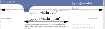
The design is a three-column layout, with the main navigation on the left, the main content in the middle, and some extra content (what I've always called 'floaters') on the right. In addition, there would be a page header and a page footer. Traditionally, this calls for a structure like this:
<div class="header">
	Header stuff
</div>
<div class="navigation">
	Main navigation floated left
</div>
<div class="content">
	Main content
</div>
<div class="sidebar">
	Extra info floated right
</div>
<div class="footer">
	Footer stuff
</div>
Unfortunately this wasn't my page structure at all, and tge "No Structure Changes" dictum prevented me from changing it.Therefore the question became how to implement a three column layout within the strictures of an HTML file that didn't contain wrapper divs.
I took one decision even before I saw the new design: I would import the main navigation through XMLHttp. A future entry will discuss this decision, as well as the fact that the main navigation is the sitemap, in more detail.
When I saw the new design had a page header that wasn't in my HTML, I quickly decided to import this header, too. Fortunately, the <div class="footer"> was present in my HTML, I'd only have to use JavaScript to fill it with the correct content, as I already did in the previous QuirksMode.org version.
That solved a lot of problems. The header, navigation, and footer divs would be imported, so I didn't have to manually create HTML structures for them. I was left with the content and the sidebar. These two were present in every page on my site, but not inside wrapper divs.
But how would force them into a three-column layout? I already had a vague idea, but before I could test it I had to take a few fundamental CSS decisions.
ems as units as often as possible. This would ensure better accessibility for people who want to enlarge the default font size.The second decision has some consequences in a variety of browsers; I'll discuss these below. The first decision impacted the basic measurements:
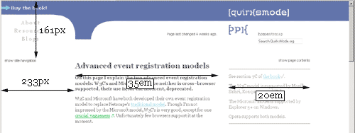
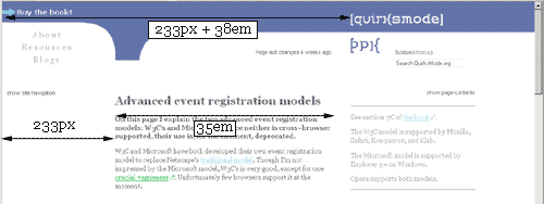
The design required a left gutter of 233px wide and a header of 161px tall. Apart from these two, though, all widths would be measured in ems. I arrived at the 35em and 20em values by trial and error.
Now I returned to create a three-column layout without wrapper divs. Fortunately the solution to this seemingly complicated problem was quite simple, because I already had a wrapper for the main content: the <body> tag itself!
If I'd treat the <body> as Just Another Block-Level Element, my problem would be solved. Therefore I gave the <body> a margin-left to leave space for the main navigation, and a width to form a nice column, and to my surprise it just worked:
body {
	font: 0.8em/140% georgia,times,serif;
	margin-left: 233px;
	color: #676462;
	width: 35em;
}
I tested this in Firefox, Opera, Safari, and Explorer 6/7, and all of them just did what I wanted, no back-talk, no odd bugs. CSS compatibility has grown remarkably in the past few years, and I'm glad to take advantage of it.
There was one slight show-stopper: my trick did not work in Explorer Quirks Mode. That was no problem, though; during the content update track I'd port all active pages to XHTML 1.0 Trans, hence Strict Mode. The only problematic pages would be the archived ones that had never yet been ported to Strict Mode. Too Bad.
Next item on the agenda: the floaters. They would have to form a sort of third column, but from 1998 onwards it has been my habit to insert floaters into the main content wherever they're needed. They don't form a column on their own.
Negative margins to the rescue. What I basically wanted was to float the floaters, so that they did not impede the main content, and then to move them entirely out of the body column:
div.floater {
	float: right;
	width: 20em;
	margin-left: 3em; /* necessary for IE 7 beta 3 */
	margin-right: -23em;
}
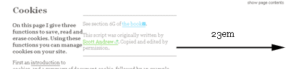
I decided on a 20em width for the floaters. Then I floated them right. Now they're floated against the right edge of the <body>:
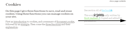
In order to pull them out of the <body> entirely, I set their margin-right to -23em; in other words: 23em to the right of where they would normally have been.
This gives the desired result:
There was one minor bug in Explorer 7. I'd defined a width: 20em and a margin-right: -23em. It therefore stands to reason that the left margin is 3em (23-20). However, Explorer 7 needed an explicit command to that effect, or it would show the floater just outside the main content. Since emphasizing the obvious wouldn't hurt the other browsers, I added a margin-left: 3em.
After this easy success (it took me only about two hours to work out these basics and get them working in all browsers), I turned to the header.
I would import a simple HTML structure (see header.txt) and insert it into a generated <div class="pageHeader"> The problem was that I wanted the header to stretch the full 100% of the browser window, but that it would end up inside the <body> with a width of 35em. Therefore this wouldn't work:
div.pageHeader {
	width: 100%;
}
Quite correctly, the browsers would interpret this as 100% of the 35em body width, resulting in a total header width of 35em, which was not what I wanted.

Therefore I had to somehow take the header out of the body and make it span 100% of the entire window. The answer to this quandary was absolute positioning. In order to understand why we have to repeat a little bit of CSS theory:
An element with position: absolute is taken out of the normal flow of the page and positioned at the desired coordinates relative to its containing block. All percentual measurements (such as width: 100%) are relative to this containing block.
What is this containing block? It's the nearest ancestor with a position other than static. If such an ancestor doesn't exist, the containing block is the initial containing block of the page.
In my code, the div.pageHeader doesn't have any ancestors with a position declaration, and therefore it's positioned relative to the initial containing block and the all-important width: 100% is calculated relative to this block.
The trick is: this initial containing block is the <html> element! The CSS parser moves upward from the div.pageHeader to the <body>, sees it isn't positioned and therefore moves on to the <html>'s parent element: the <html>. Since I don't set a width on the <html>, it has width: auto, which for block-level elements means 100% of the available width.
Therefore the <html> element spans 100% of the browser window, and consequently the width: 100% of the page header is interpreted as 100% of 100%: the full window width!
Unfortunately, although all this works fine in Explorer 7, Explorer 6 and lower aren't up to this advanced CSS wizardry. In Explorer 6 and lower, the initial containing block is not the <html> but the <body>, and therefore these browsers interpret the width: 100% of the page header as 100% of 35 em. Hence the most obvious "error" on this site: the narrowed page header.
Incidentally, Opera 8 and lower have the same problem. Fortunately this bug is solved in Opera 9.

Now I still had one nut to crack. The "quirksmode" and "ppk" logo were supposed to line with the floaters, but that meant their left margin would have to be 233px + 38em; and, as we all know you can't say margin-left: 233px + 38em.
I solved this through absolute positioning, too. The principle is very simple:
div.pageHeader a.logoQuirksmode {
	position: absolute;
	left: 233px;
	margin-left: 38em;
	top: 25px;
}
As soon as an element is positioned absolutely, you can assign values to both the margin-left and the left properties. These are added when the time comes to determine the exact position of the element.
Therefore I simply assigned the 233px to the one and the 38em to the other, and the logo is lined with the floaters and stays lined even when the user changes the font size.
As I said above, I decided to use only one single CSS file without hacks and without conditional comments. All browsers receive this file, and it's up to them to show my site correctly—or not. Above I already explained the most obvious problem on this site.
Nonetheless, there are a few more subtle ones, too. For instance, the "home" and "sitemap" links at the right top of every page should have a nice, user-friendly gap between them. For reasons that are too complicated to explain right now I decided to give these links display: inline-block and set widths and text-aligns on them. The problem is, despite years and years of development no Mozilla browser yet supports display: inline-block. Therefore the links are right next to each other in Mozilla.
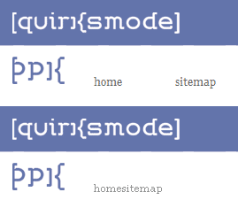
I could have used the Mozilla proprietary syntax display: -moz-inline-box, but I deliberately decided not to. I'll wait for Mozilla to support the standard.
In the Gospel according to St. Jakob we can read:
"The color for unvisited links should be more vivid, bright, and saturated than the color for visited links, which should look "used" (dull and washed out)."
My site uses three different link types, each with their own colour: external links to other sites, internal links to other pages at QuirksMode.org, and page links to another anchor in the same page. In the previous redesign I'd calculated a proper visited link colour and applied these colours to the several link types.
However, when I was creating the new link colours, an obvious solution hit me. How can we make sure that a visited link is more dull than an unvisited one, without defining specific colours? Simple:
a:visited {
	opacity: 0.7;
}
We make visited links slightly less opaque than the unvisited ones, and the dull, washed-out scheme is applied automatically, regardless of the exact link colour. Now I can change link colours whenever I like without having to bother with calculating new visited link colours.
Unfortunately Explorer doesn't support opacity. I could have used the Microsoft proprietary syntax filter: alpha(opacity=70);, but I deliberately decided not to. I'll wait for Explorer to support the standard.
That concludes our discussion of the CSS. In a future entry we'll discuss the JavaScript that goes into the new QuirksMode.org, especially the importing of various bits of content and the fact that the main navigation is the sitemap.
This is the blog of Peter-Paul Koch, web developer, consultant, and trainer.
You can also follow
him on Twitter or Mastodon.
Atom
RSS
If you like this blog, why not donate a little bit of money to help me pay my bills?
Categories:
Comments are closed.
1 Posted by Leszek Swirski on 14 September 2006 | Permalink
So the only browsers that show the design properly are IE7, Opera, and (I assume) Safari?
Though I must say that I disagree with your inserting the header via Javascript — it seems the wrong tool for the job. If you have a new header, then that's a new semantic element which should be in the HTML — if you don't want to change the HTML then use a design with is exactly the same semantically as your old one. The concept behind CSS is not that you can entirely change your design at a whim, just that you can change the appearance of semantic sections of your content. If the content were to change, like your adding a header here, then the HTML should change.
At least, that's how I understand the ideology behind it all; I'm very open to corrections!
2 Posted by David Smelser on 14 September 2006 | Permalink
One problem with your new design is that it falls apart if your screen DPI is set to anything other than 96 DPI. I have a high resolution flat screen so I run my DPI at 120.
The end result is that your center column is too wide and is pushed below your right column.
3 Posted by zcorpan on 15 September 2006 | Permalink
>The trick is: this initial containing block is the <html> element!
No, it isn't. The initial containing block is the viewport.
4 Posted by Tino Zijdel on 15 September 2006 | Permalink
Leszek: no, not IE7 because it doesn't support opacity ;)
PPK: note that -moz-inline-box is not exactly the same as inline-block. You could however have considered using floats.
5 Posted by Seb on 15 September 2006 | Permalink
The idea as you suggest that you have to go through 220 pages or whatever it is just to change the DOCTYPE or add some conditional stylesheets to enable the importing of ie6 styles etc, scares me silly!
Why aren't you useing SSI to include stuff? For instance the start of a page on a site I'm working on now looks like:
<!-- #INCLUDE virtual="/inc/doctype-etc.html.inc" -->
<head>
<!-- #INCLUDE virtual="/inc/metas-etc.html.inc" -->
<title>blah</title>
<meta name="description" content="blah" />
<meta name="keywords" content="blah" />
</head>
<body id="home">
<!-- #INCLUDE virtual="/inc/header.html.inc" -->
Where doctype-etc.html.inc is
<!DOCTYPE html PUBLIC "-//W3C//DTD XHTML 1.0 Transitional//EN" "">http://www.w3.org/TR/xhtml1/DTD/xhtml1-transitional.dtd">
<html xmlns="http://www.w3.org/1999/xhtml" xml:lang="en" lang="en">
If I want to change the DOCTYPE site wide it's a one minute job - similarly if I want to add a print stylesheet or something, I just add it into metas-etc.html.inc.
For some reason you're not using SSI, but even then, surely you can devise a simple search and replace to change the DOCTYPE of all files, and add a conditional comments line to all files?
6 Posted by Seb on 15 September 2006 | Permalink
Sorry, forgot to mention something earlier.
Looking at your source you have
<img src="/pix/QMredesign_float1.gif" class="screenshot" alt="The floater without negative margins" />
It's only a little thing, but you should (IMHO) be using a title attribute, not an alt attribute. The alt attribute is (as you know, but some readers may not) for when the image cannot be displayed - or for when the user is visually impaired. There's no point telling them that what they can't see is "The floater without negative margins" as it doesn't help them at all.
The title attribute is better suited to what you're trying to achieve. Your alt attribute should (imo) be empty in this case.